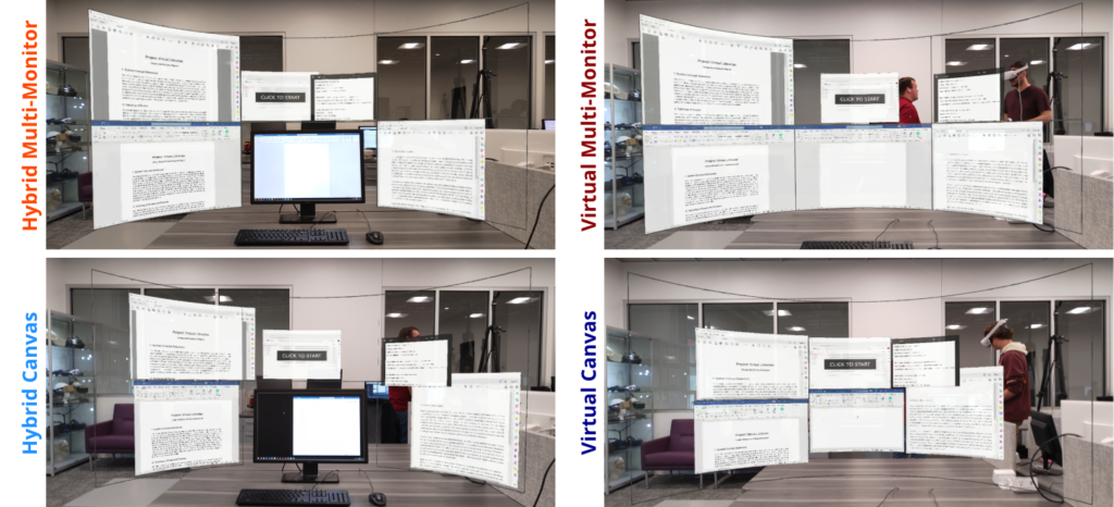
Virtual displays have unique characteristics that can yield extensive amounts of screen space. Existing research has shown that increasing the amount of space on a computer screen can enhance usability. Since such displays offer the unique ability to present content without rigid physical space constraints, they provide various new design possibilities. Therefore, we must understand the trade-offs of layout choices when structuring that space. We propose designing a single canvas approach that eliminates boundaries and bezels from traditional multi-monitor approaches and instead places windows on a single, unified space. Our user study compared this approach against a multi-monitor setup, and we considered both hybrid and purely virtual systems. We looked into usability factors such as performance, accuracy, and overall window management.
Results show that canvas displays can require more layout optimizations than multi-monitor with snapping behavior, even though such optimizations may not lead to longer window management times. We did not find conclusive evidence of either providing a better user experience. Multi-monitor displays offer quick window management with snapping and a structured layout through subdivisions. However, canvas displays allow for more control in placement and size, lowering the amount of space used and, thus, head rotation. However, multi-monitor benefits were more prominent in the hybrid configuration, while the canvas display was more beneficial in the purely virtual configuration.

Journal Articles
Multiple Monitors or Single Canvas? Evaluating Window Management and Layout Strategies on Virtual Displays Journal Article
In: IEEE Transactions on Visualization and Computer Graphics, 2024.
